


The Road to a Mechanical Ragging Component
From stop motion to animating graphics with After Effects, carving letters on wood blocks to create scalable vectorized letters with Glyphs, RoboFont, or FontLab, design tooling is accelerating faster than at any other time in history.
A few years ago, team collaboration on design projects was challenging. One designer focused on the design, while others might be giving feedback on snapshots of their work, but no design tool allowed multiple users to update a design at the same time. Figma emerged as one of the most popular design applications thanks to its focus on collaboration and portability. It gave entire teams the ability to work on a project at the same time, without needing to sync assets or even install it.
Since then, graphic design has been in a stage of steadfast development in many media; typography, printing, 3D design, AR/VR, etc. Every design media is advancing internationally and globally.
Nevertheless, typesetting has been standing considerably distant from the modern digital design circles. Typically, typesetting methodology has only been leveraged in the field of print and traditional design. In the digital world, it is almost invisible. It makes sense; there are no convenient typeset editing methods in web environments. Typically, developers would be asked to apply a typeface on a website, adjust the font-size, and maybe justify the alignment and font-weight. If developers want to implement more advanced settings to a paragraph, like controlling the paragraph flow, they might hit a brick wall because standard CSS cannot accommodate these features.
For typesetting, its roles include visual displays, communication, coherence, and establishing a framework for the design. In the current digital world, the choice of typeface, font size, font leading, and type alignment are all within our purview. However, we do not have ready control over the flow of a paragraph.
The flow of a paragraph is limited to only left-aligned, right-aligned, and center-aligned text; it does not relate to justified text, in which each line of the text stays the same length. A properly manual ragged paragraph would flow in a balanced composition of alternating line lengths; one long, one short. It flows without forcing the eyes to jump, which would hamper the readability of the text. More advanced typesetting would even consider the meaning of the text and associate it with the actual appearance. Even further, some designers would prefer not to put a short word at the end of each line for better readability. Short words like “a, an, of, the, are, is...” should not appear at the end of each line by this logic.
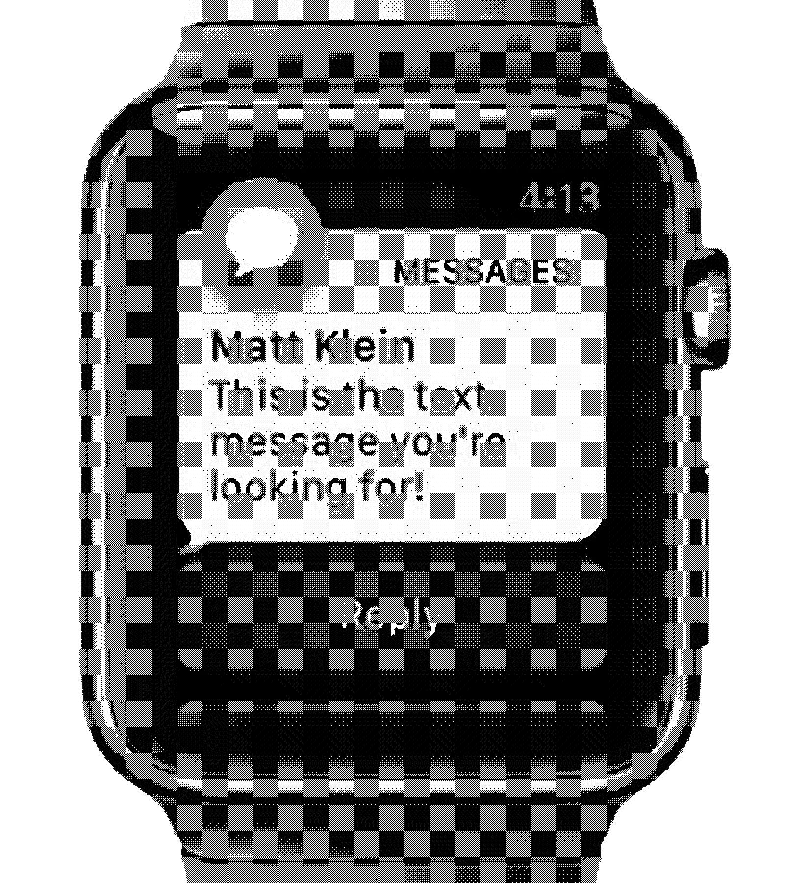
Back to our case, typesetting on the web can be quite complicated. The interactive display is limitless, different than a static frame on a piece of paper; its size varies to fit in any display. When web designers design a website, the website should reflow functionally across all different screen sizes. This interactive medium brings convenience, but it could be forbidden for typesetting. In some extreme contexts, the display screen might show only one word on each line. Reading a message from a 40mm Apple Watch (394x324px), a medium-length paragraph would be divided into multiple lines, produces a difficult reading experience regardless of its actual content. Under such conditions, using a more balanced paragraph rag would reduce the difficulty in reading.
The idea of balanced text rag, or long-short-long-short ragging method, likely originated in handwriting and 20th-century book designs, along with regulated and balanced text ragging examples from modern swiss book designs. (See examples of ragged text at the Examples page) Some early Swiss books establish a clear systematic design layout, and of course, typesetting is within their realm. Swiss design systems later encourage more designers to take part in thinking of typesetting as a fundamental building block of design.
Text ragging is well-defined, so we started by investigating the technical end and seeking the right vehicle to begin our digital ragging componentv concept.
After few weeks of research and development, we decided on a JavaScript component that automatically trims the line endings. Put this more simply, each line of text was extracted and calculated, and the even lines were selected. After that, extrusion formulated coordinates the font size and its leading, matching the exact line spacing with the text.
We named this web add-on as Mechanical Ragger. As the name implies, it is a very mechanical enhancement. It does not do some of the optimizations mentioned above like removing short letters at the end of a line or typesetting a paragraph based on its content. In the future, though, we may find ways to handle these tasks automatically.